Image


Jun 25
| 6 minutes
read
Does Font Psychology Affect Email Conversions?
What makes an email stand out? And what motivates the subscriber to take the desired action? Content is an obvious answer, but in the end; no one will read it unless you present it with flair. In this blog post, you’ll find out how the right fonts and colours can rev up your email conversions.

Make It Pop: Why Fonts and Colours Matter
How can you present content in a way that captures the attention of the users? The answer is fonts and colours. The colours reflect the personality of the brand, while the font communicates with the audience.
When it comes to typography, there are quite a few things that impact the conversion rate of an email campaign. For instance, you’ll need to choose the right fonts, sizes, and colours for the content that are impactful enough for the email recipient.
The guiding principle is that your typography and graphic design should communicate and convey your brand personality. But this isn't the whole story...
A common misconception is that fancy or decorative fonts attract attention, but that’s not always true. If your fonts aren't legible (i.e. the letters can’t be distinctly read) and readable (i.e. the words can't be skimmed through or are read with difficulty), you need to reconsider your choice.
Fonts are typefaces with a specific size, weight, and width. The fonts are very important, considering you are viewing the same content across various devices, making it essential for you to choose one that suits all purposes.
The question is: How do you pick the right font, and what are the various fonts that are specifically used for typography in emails?
The Battle of Typefaces: Serif or Sans Serif?
The first thing that you need to choose when considering fonts for your email marketing campaign, is whether you want to opt for serif fonts or the sans serif fonts. But what's the difference?
The serif typeface, including Times New Roman, Courier, New Century Schoolbook, and
Palatino, are fonts with protruding lines or strokes, “serifs”, at the end of the characters.
The sans-serif font family, such as Helvetica, Avant Garde, Arial, and Geneva, are
devoid of protrusions.
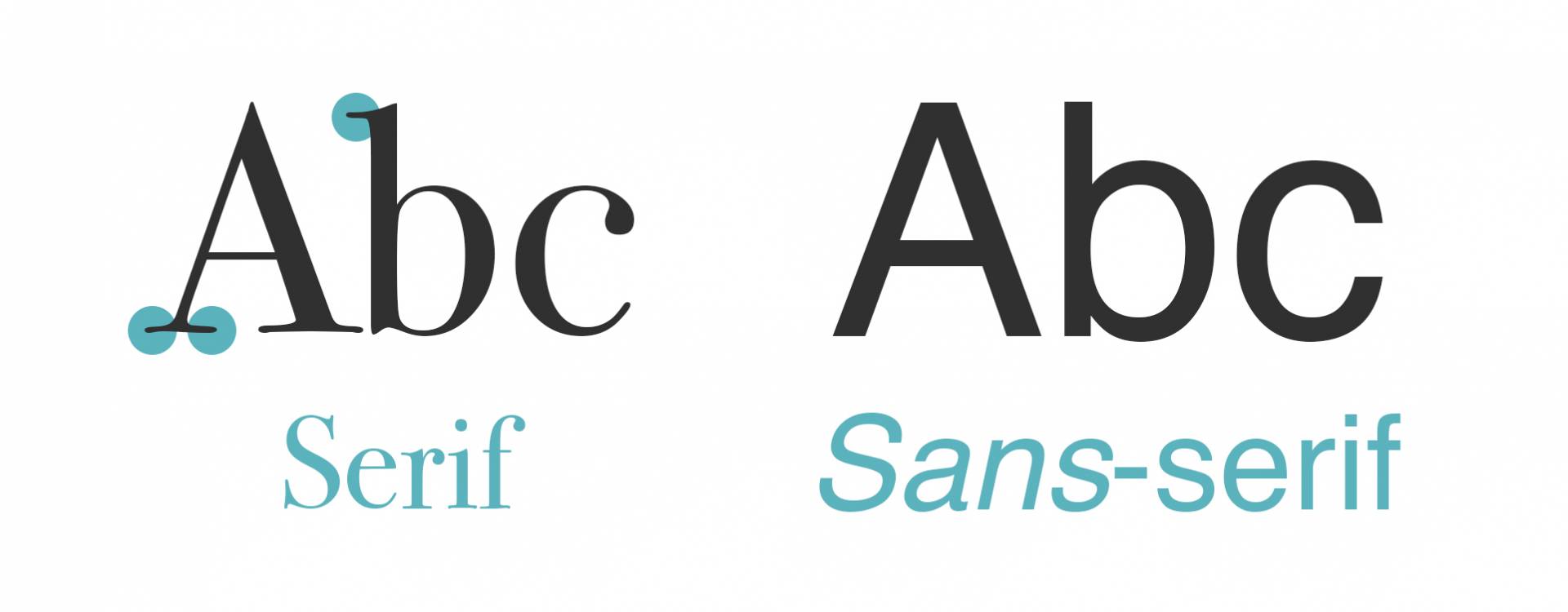
The debate on which fonts to choose is ongoing and highly trend sensitive. Serif fonts are generally considered more traditional and fancy, whilst sans-serif fonts are viewed as more modern. For most, sans serif fits the bill. Others believe that the serif fonts are better for overall text comprehension;
especially in emails. You can always combine the two so that your emails can be both fancy and legible. It all depends on your brand personality.
Any attention-grabbing line should be represented using sans-serif fonts. This way you’ll get the desired action from the subscriber. General Assembly offers an example:

As received in Kevin’s inbox
Sans serif, on the other hand, is more effective when the email has short text blocks that contain few lines. Take a look at the email below:
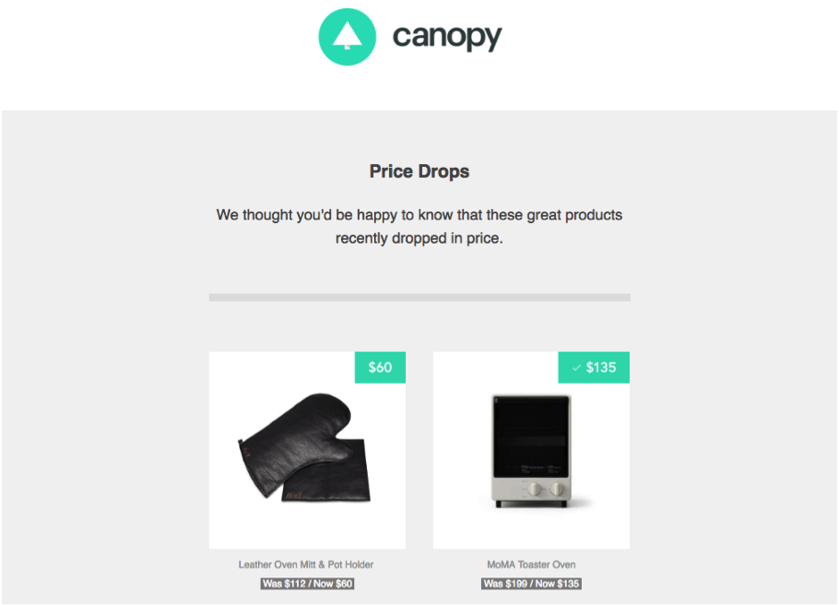
Source: https://www.reallygoodemails.com/
Font Size is Pivotal for Readability – And Engagement
A real head scratcher in the marketing sphere is: does font size really matter? Well, I'm here to tell you that it does! You need to choose fonts that are not just readable, but can be scanned through with ease, as some of the readers may not have the time to read them completely. The general rule is that:
It's a good idea to choose a 12-size font when you work on email content.
This is the standard font size and reduces the overall reading time. Combined with the standard fonts, and the expressions, you will see that people tend to engage better with these emails. The other font sizes communly used in emails are 10-point and 14-point. However, it’s a general rule of thumb that it's better to stick to the 12-point size.
Quick tips on font size:
- Avoid using 12-point font size in headlines, as they may not garner the expected response from the users.
- 12-point size works perfectly for the main body content. It makes the content readable and allows readers to spend less time and understand the content better as a result.
- Use 10-point sizes when you want the users to stay on your email page for a while.
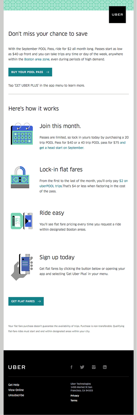
Uber understands this strategy quite well, it seems…
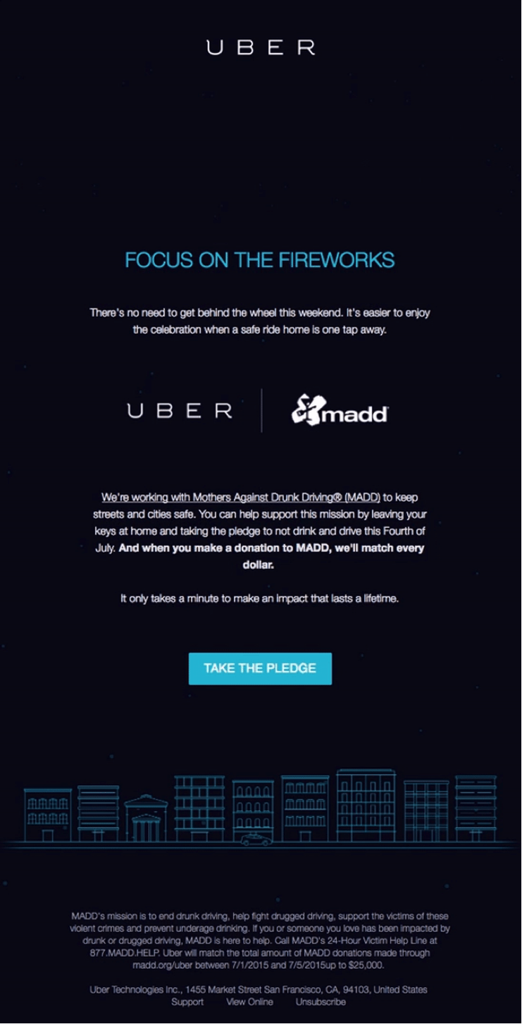
Source: https://www.reallygoodemails.com/
Are You Modern, Simple, Traditional or Fancy?
When choosing the fonts, you need to keep in mind that the ultimate goal is to increase email conversions.
On average, readers take 86% longer time to read decorative fonts than simpler ones, such as Arial. There are plenty of subscribers that will shy away from reading the fancier fonts, as they might not reach the quota of legibility and readability. You can opt for them in some cases, but you should avoid utilising it in an email format.
This email by MAC cosmetics is an inspiring example of how you can use a combination of simple and fancy fonts in the same piece of content. The fancy fonts are used in the heading to grab attention.
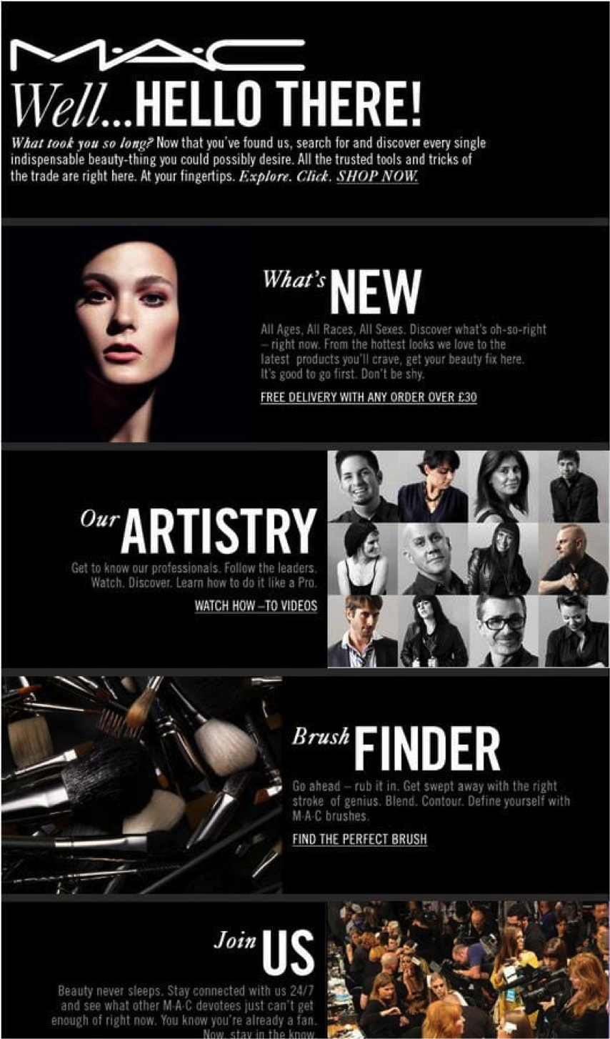
Source: https://in.pinterest.com/pin/476607573040660251/?lp=true
Getting Balanced: Why Line Spacing is Important
Akin to white space, line space is important in order to make the content readable and feel less heavy to the eye. In addition, it optimises the overall typography that you have chosen for the emails. The spacing also allows the reader to skim through the content, in order to get an idea over the actionable insights it may contain, and take the desired action.
Source: https://www.reallygoodemails.com/
Standard line spacing is approximately 1½ size of the font size. As the message gets clearly conveyed and interpreted, the email is more likely to yield conversions.
The Best Fonts for Emails
When it comes to emails, there are limitations. Why? Well, because far from all fonts are supported by all email clients.
However, there are instances when you want to choose fonts that are customised to showcase your personality. For this purpose, you should rely on fallback fonts. These fonts are substituted in case the email clients don’t render the fonts that you have chosen for the emails.
Always send a copy of the email with the custom font to yourself to check if the fallback font works or not.
Fonts that you ought to choose for maximum conversion:
- Arial
- Verdana
- Tahoma
- Lucida
- Trebuchet
- Times New Roman
- Comic Sans, Impact
- Courier New
- Palatino Linotype
Key Takeaways:
- It’s always good to stick to standard fonts when designing your emails. Almost all email clients will support these standard fonts, and chances of missing out on any aspect of the content is rare in such cases.
- When designing the email, don’t use too many fonts. Go for two fonts maximum for the best results. Make sure there is a certain level of consistency throughout the email for best results.
- Don’t forget to test the emails before sending them. In case of custom fonts, this is an important exercise, as it will tell you whether or not your email fonts get substituted with the fallback fonts.
To Sum It All Up...
Fonts do indeed make a difference in the way in which subscribers look at the content and decide whether or not to take the decision. It is a good practice to use standard fonts that communicate your style and the brand’s image, while reflecting its personality.
Want to take your emails to the next level? Find out how APSIS One can help you on your quest!
This post was written by Kevin George, the Head of Marketing at Email Uplers. He loves gadgets, bikes, jazz, and breathes ‘email marketing’. He enjoys sharing his insights and thoughts on email marketing tips and best practices at his email marketing blog.