Image


Mar 16
| 4 minutes
read
How to Make Your Email Design Pop in 2017
Relevant images, crisp texts, snappy subject lines…
If you want to design your emails for success, it’s a matter of trial-and-error. However, if you hit it right, your success will be reflected in the numbers. Marketing is all about being on trend nowadays, so how can you bring your emails up to pace for 2017?
No time to read today? Here’s what you need to know:
-
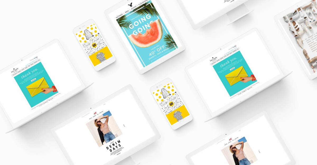
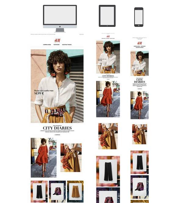
Responsive email design is a given for this year - as is the minimalistic trend from 2016
-
Interaction within the email environment is on the uprise, now that technology is catching up with ambition
-
Cinemagraphs, vivid images and colour are a great way to capture your readers’ attention
-
If you really want to stand out, think about content too: especially personalised subject lines
Aren’t Emails Passé?
Incorrect! As a matter of fact, email marketing is still one of the most effective marketing channels with an impressive return of investment that amounts to a staggering 3800%.
With this in mind, it’s hardly a coincidence that emails have become the primary digital marketing channel for e-commerce, for example.
Smartphones Will Guide Us
Did you know that smartphones have now become the most common device to read emails on? It’s true. As a matter of fact, 56% of emails are opened on mobile devices.
It’s obvious that 2017 will follow 2016’s suit of responsive email design. We’ve all received emails that aren’t optimised for smartphones - do you continue reading them? Neither do we.
If you want to stay savvy in 2017, make sure you create a single column layout with a width of 600 pixels. This optimises your emails for all devices and increases your opening rate - which, in turn, makes the lengthy time you’ve spent on the creation of beautiful images and snappy texts well worth it. After all, it will result in a larger turnover.
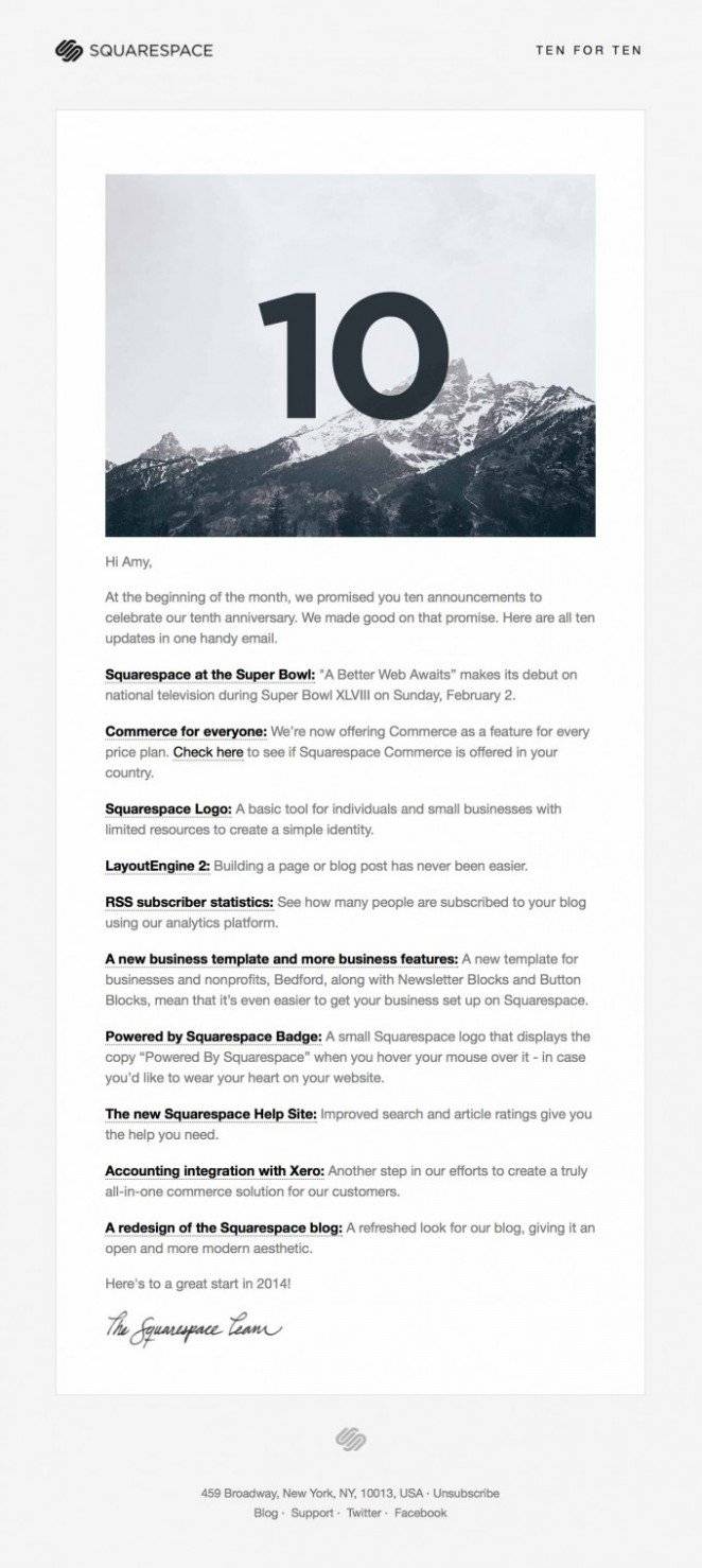
Less is Still More
Minimalism is here to stay. From what we can see, the 2016 minimalist trend will continue to fight its way into the new year and beyond - focusing on simplicity and functionality, where white spaces draw attention towards certain focal points.
If you think about it, minimalist design does make functional sense in email marketing. With email users’ short attention span, your message should be delivered with beautiful and efficient simplicity. Easy, yet brilliant.
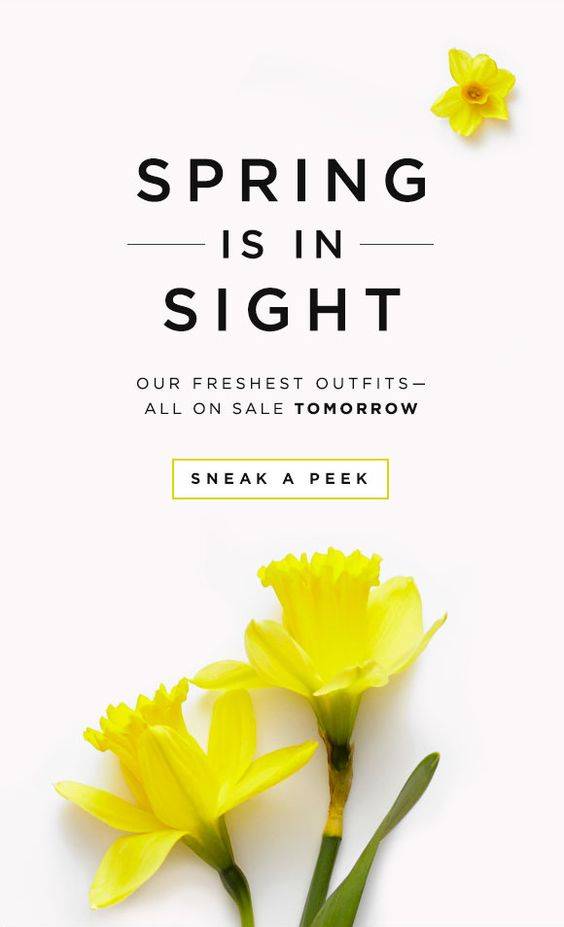
Eye-catching Images
The 2016 trend of vivid hero banners will also transcend into 2017. This is simply because people continue to enjoy visually appealing images and layouts. So images and a well-thought-out design will increase the likelihood that potential customers will continue reading your email.
If you’re looking for something that’s particularly “in the now”, check out emails with artsy details. Preferably with bold images that command attention.
Interactive Emails Will Sweep Us Away
Creating interactive emails has been a dream of the future for years now. However, due to the ironing-out of techniques, the improvement of email tools and extended CSS-support by email clients, interactive emails are poised to become a major trend for 2017.
Unsure what interactive emails actually mean? They’re best described as emails where you can take actions within the email environment, which then triggers an event in the email itself.
From image carousels to CSS-animations and interactive calendars, interactive elements in emails create user excitement and leave a lasting impression. (Not just that, but it reduces the barriers of further B2C and B2B engagement too!)
The Rise of Cinemagraphs
Remember those vivid hero banners? In 2017, they might also be accompanied by cinemagraphs – still photos with a single, eye-catching, minor movement. This newer image type provides a quick solution for one of marketing’s biggest problems: time. The single minor movements lure in your attention and increases the probability of continued reading. Which means one thing: cinemagraphs are coming to a screen near you!
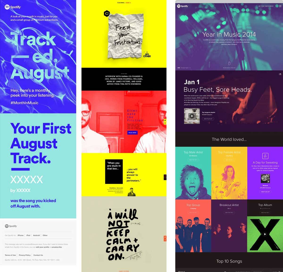
Continue to Create a Pop of Colour
Colour is a major communicator. It plays with culturally associated emotions that make you feel or act a certain way, in relation to the hues of the email. A colourful email creates an energetic brand association, whereas a neutral colour scheme evokes a sense of natural calmness.
Furthermore, if you want a certain text or image to be differentiated from the rest – like a call-to-action, for example – make sure it pops! Colour is the enforcer of emotion and the creator of informative distinction.
(If you’ve dipped your toe, or perhaps entirely dived into the pool of Big Data, you should definitely optimise your choices of colour and layout according to your collected data.)
+1 Tip: Personalised Subject Lines
You know the subject line standards: 50 characters or less, and keep it clear and crisp! But did you know that a personalised subject line creates a dramatic increase in your unique opening rates? This way, the demand for personalised content transcends into the subject lines, that in turn strengthens the feeling of the personal interaction.
If you’d like to follow the tech-trend of personalisation through Big Data and feel like you’re in need of assistance in the creation of your emails – contact us! We’ll help you help yourself.