Image


May 04
| 5 minutes
read
The Hottest Email Design Trends of 2016 (So Far)
Email design is like ice cream. It has so many delicious flavours: minimalism, colour blocking, image focus or a text-first approach... And just like walking into an ice cream parlour, it can feel a tad overwhelming to see the many, many types of email design out there. Which is why we've collected the best of the best for you right here! Each of these 10 email design trends means a fresh opportunity for you to delight your customers, whether you're B2B or B2C, selling sandals or software. So go ahead - our virtual email design parlour awaits!
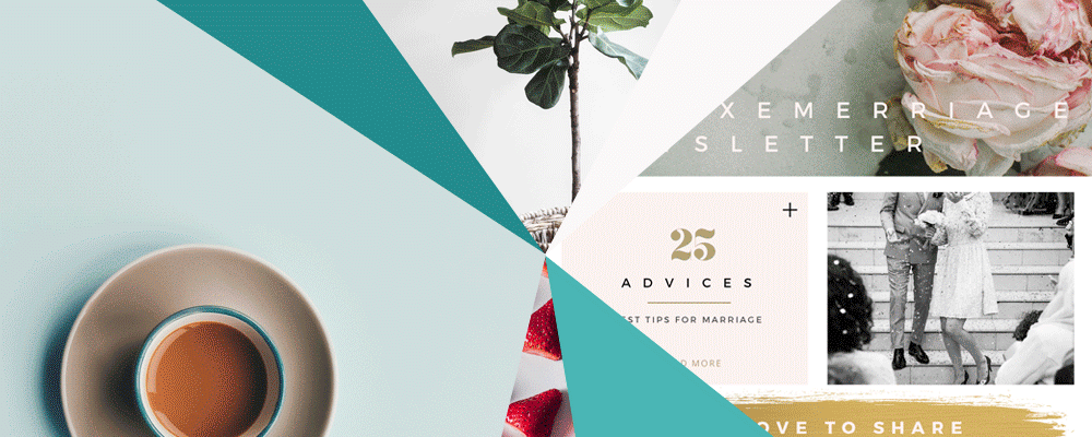
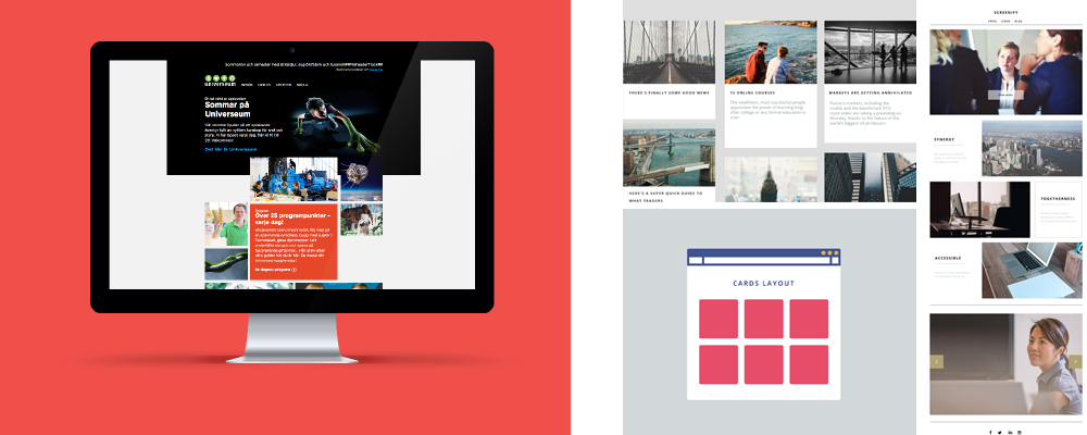
Card layouts are everywhere
The popularity of Pinterest throughout the world has attracted lots of email designers to its trademark card design. And although today, we mostly see this so-called “classic” card design, it is set to grow and develop rapidly in the near future. Which in turn will lead to its even wider popularisation through channels like Facebook and Twitter. All this makes newsletters designed with card design seem both current and forward-thinking - an ideal combination!
Less is more: keeping it minimal
Minimalism is one of only a few design trends that never gets old. Its simplicity makes it easy to add to a number of other styles and trends. There are so many benefits: it’s classic, classy, it works with (and emphasises) many different types of content... When it comes to emails, the focus on space, simplicity and beautiful typography refreshes subscribers and grabs their attention. As for 2016? Minimal design will continue to take over website, app and print design as well as newsletters. Which, as far as we’re concerned, is really good news.
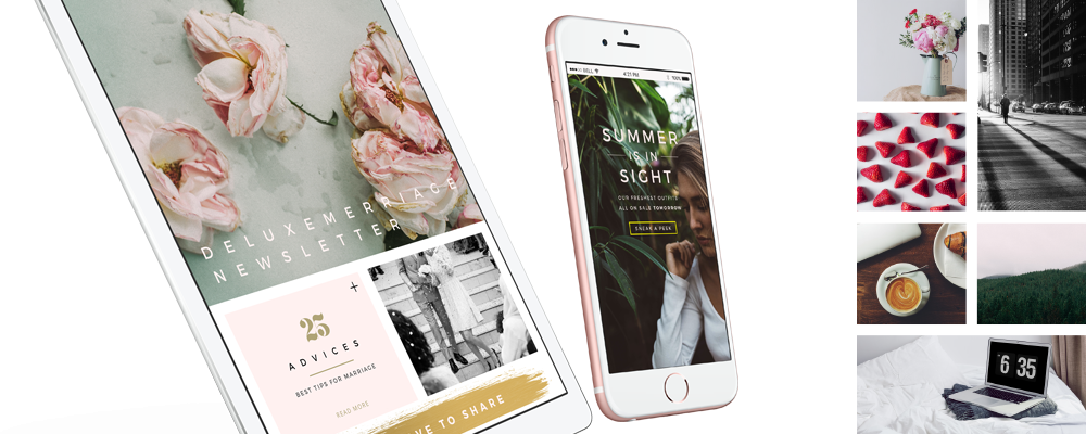
More and more image-based sendings
Our vision is our strongest human sense. So it makes sense that HD hero images are one of the fastest ways to grab a subscriber’s attention. A common layout you’ll find on newsletters today is a hero image above the scroll, followed by either zig-zagging sections or a cards-based arrangement. It’s a good fit: these images work well on mobile devices, and they’re also a crisp contrast to both white space and minimal design. Try to steer clear of stock images, however: 2016 is the year when stock photos will probably lose their dominance in the image market. Why not invest in some high-quality owned images or illustrations instead?
Introducing "Flat Design 2.0"
The simplicity of flat design makes interfaces much more intuitive for visitors - this much we learned in 2015 already. But now and in the near future, flat design will develop and expand into something designers call “Flat 2.0”: a balance between completely flat design and art design. In practice, this will mean that email designers will still keep things “flat”, but they’ll also use subtle shadows, highlights and layers to create some depth in their newsletters. A true reason to call 2016 the Year of The Almost Flat Design!
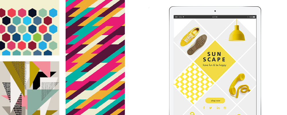
Go square or go home!
Geometric shapes and patterns in newsletters are already present in several sendings - and in 2016, this trend will grow even stronger. The best thing about it? You can use it in so many ways: individual graphic elements, background images, illustrative techniques, whatever an ambitious email designer can think of. The possibilities are endless.
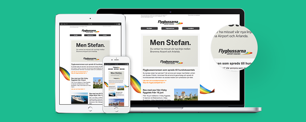
Responsive design: A must-have
We all know that a responsive website is not an option anymore: it’s a must-have. Mobile has officially become the “first screen” in many people’s lives. Which means that email designers have to adapt their creations to the mobile environment, or risk their designs falling apart once subscribers reach for their smartphones. And remember: responsive design means perfect usability on a smaller screen: optimised images, large CTAs, readable text size, digestible amounts of content. The works.
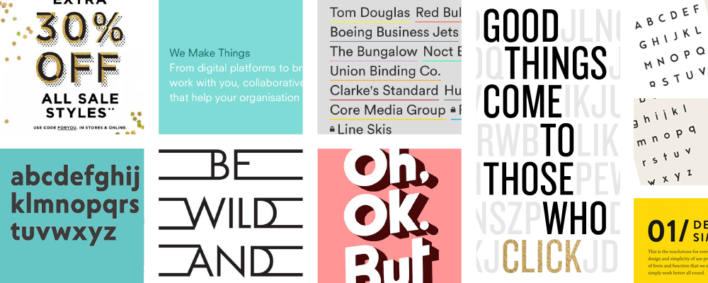
No need for special fonts
In 2016, sans-serif fonts which are easy to read in a flat design environment will be the ruling favourites. The emerging importance of readability also means that - besides company logos - simple and pleasant fonts will overpower bespoke typography to create easily readable content in emails. Font sizes will also increase to better catch subscribers’ eyes, as well as making the content readable on mobile devices like we said before.
Mix it up with GIFs
We’ve talked about GIFs before, and how they can add flavour to email sendings. In 2016, get ready to think outside the GIF-box, as email designers take GIFs one step further and add large-sized GIF-loops to their newsletters, occupying much of the email real estate, so that they can make their subscribers go “wow”! Email marketing has never been so entertaining.
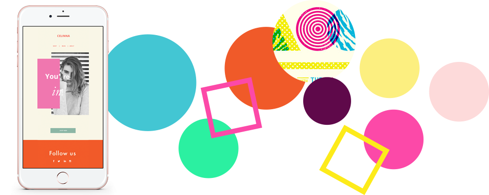
When in doubt, just add colour
Instead of flashy visual elements, the newsletters of 2016 will use dynamic colours to make a statement. Since exciting colours contrast well with each other, adding only a splash here and there allows email designers to freshen up their emails quickly and easily. And while the bright colour palette is an integral part of flat design, it seems that email designers will return to the standard palette in 2016: bright, 80s pastels, with bold shades used for accents.
Standing out from the crowd
Of course, the biggest challenge for email designers is to create something memorable enough for subscribers to remember past their 9-second attention span. Which means that sometimes, the best rule is to break all the rules - something we’ll see a lot of in 2016. New combinations of images and illustrations, playing with dimensions or subverting them altogether are all ways to make an impression. Again, the possibilities are endless - good luck!