3 Email Design Challenges - Solved!
What’s the best moment of the day for an email designer?
We think it’s when they come up with a solution which isn’t only beautiful, but solves a challenge for their company or client.
This is why we reached out to our own Creative Services team and asked them a simple question: what challenges have you solved recently?
This is what we found out…
So many (background) colours!
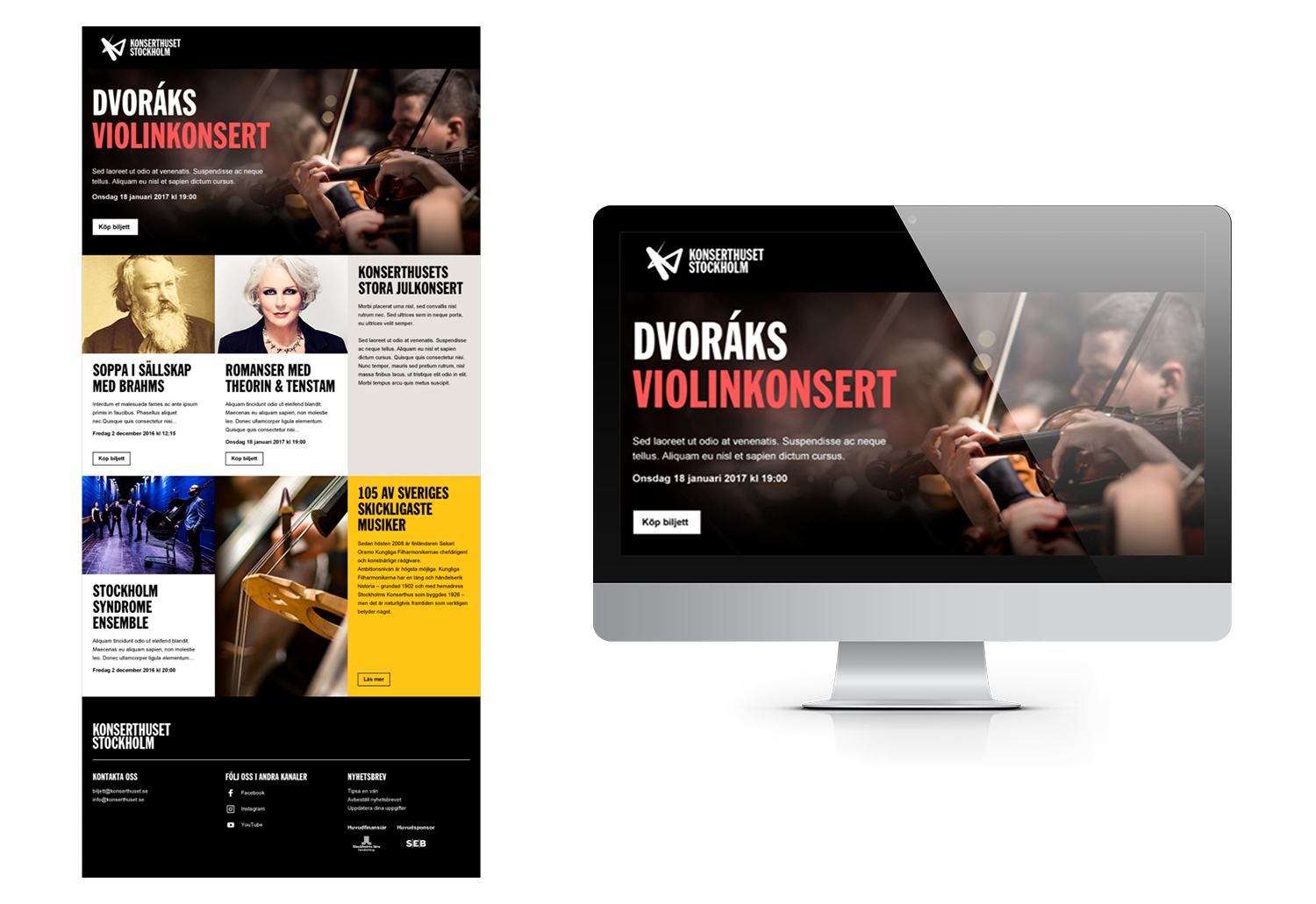
The most important feature Konserthuset Stockholm wanted for their brand new email template sounded simple: they needed each of their modules to be customisable.
In practice, this translated into them needing each module to have 40 (!) potential background colours (...a request our email designers don’t often receive!).
The reason behind this wish? Konserthuset Stockholm wanted a grid structure for their emails to make them look ultra modern - and the end result fulfilled their highest hopes.
Tables on a small screen?
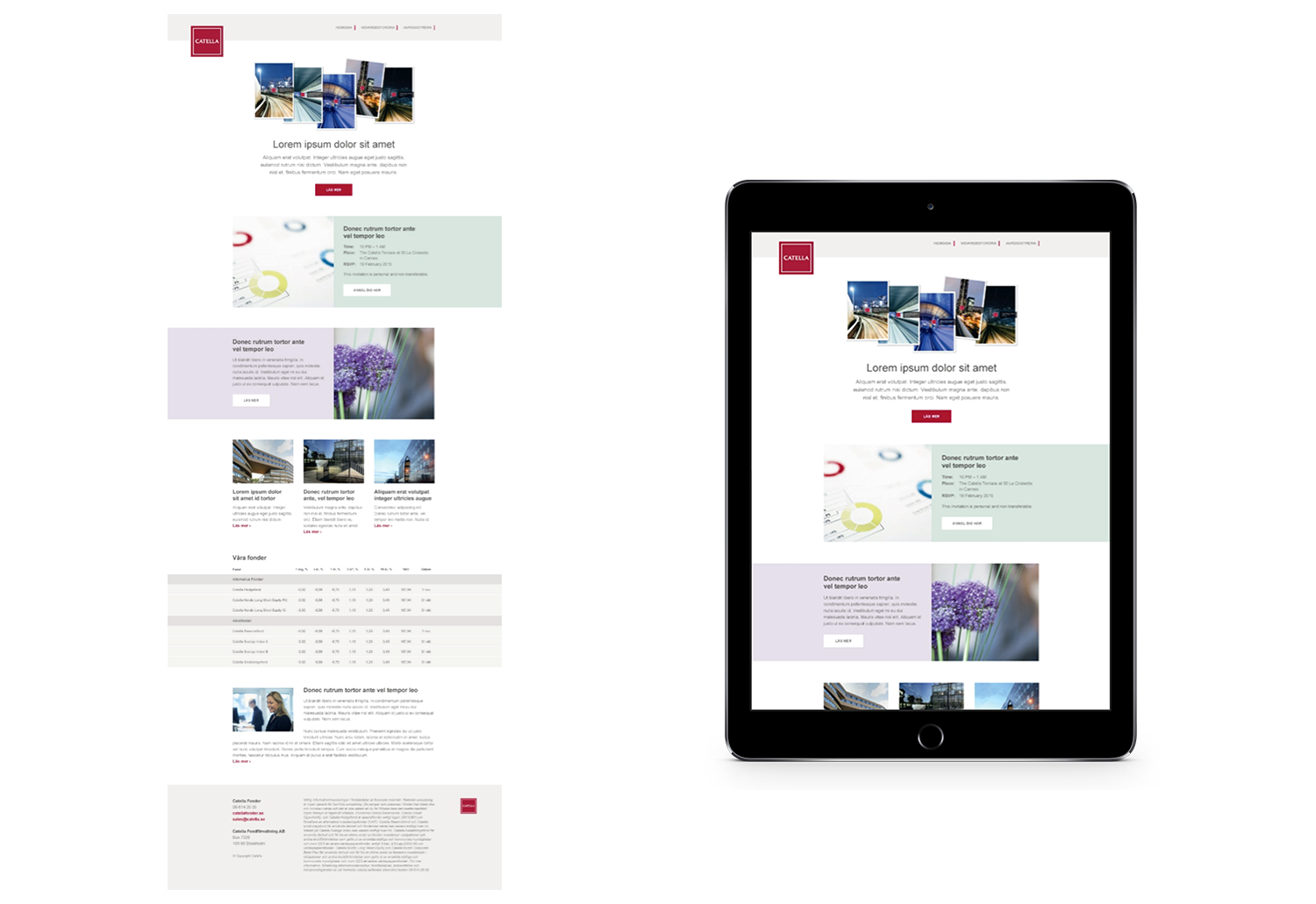
Fund management company Catella send out lots of interesting information to their subscribers regularly. Being in the fund business, this information often includes numbers: percentages, increases etc.
Including a table module in their email template sounded fairly basic - but since we live in the age of mobile, Catella needed these tables to be easily viewable on small screens too (e.g. tablets, smartphones), even if they have several columns.
Our email designers solved this by adding a surrounding element to the table, which made it scrollable horizontally on mobile devices - problem solved!
Colour transitions & text wraps
Often, a company has a well-defined graphic identity when they approach us. Which means their new email template already has a few requirements placed on it, before any work has actually started.
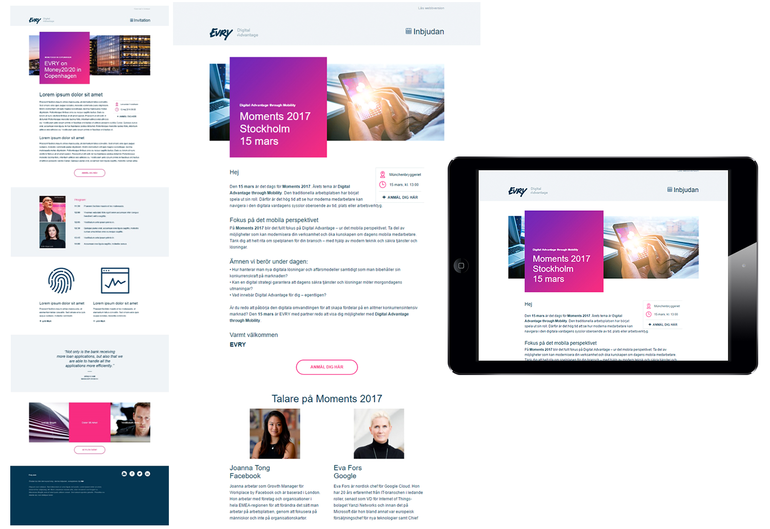
In the case of Nordic IT company Evry, a key element of their graphic identity was having boxes with colour transitions (i.e. changing from one colour to another) as the background for their headlines. So our email designers had to find a way to enable this for their template too.
Evry also wanted a custom-made text wrap module made for their template, since they knew they were going to use the template to send out invitations for their events, and this way they could add information about the event on top.
The end result was something that both fitted their requests and complied with their graphic identity - a win-win situation for everyone involved!
Hungry for more email design? Check out our Email marketing handbook!

