Interactive Emails?
When it comes to interactive email design, everyone has a different opinion.

While email marketing analysts have been predicting (and worshipping) interactive emails for years (!) now, email designers themselves have been slightly more wary. But why?
Let’s put it this way. Whenever an ambitious email designer managed to put together a flashy interactive element in an email, s/he would inevitably realise that there’s no way to make it work for all email clients. Not very inspiring.
Luckily, two recent changes have made such worries quite unnecessary. First, the constant evolution of technology (think HTML5 in emails, for example), meaning that more and more email clients (e.g. Apple Mail, Gmail etc.) can cope with interactive elements within the email environment.
And second, a general attitude shift about these elements not showing up after all: having a fallback option (usually the first image in a sequence) for email clients like Outlook no longer scares the majority of email designers, leaving them free to experiment with new techniques to delight subscribers around the world.
Because that’s the main benefit of interactive emails: grabbing and holding the attention of your subscribers! We’re at the stage where personalised content or a snappy subject line alone won’t engage them nearly as much as, say, a year ago. Don’t get me wrong: it’s still essential to have these things, of course! But to really stand out, you have to give your recipients a little something more.
Some important things to consider
Despite the technological evolution of email design, we still have a long way to go before interactive emails becomes the new industry standard. So if you want to push the boundaries within email design there are things to consider.
First, even if some email clients now support interactive emails, there's still a lot of email clients that doesn't. And second: even if the email client supports inteactive design, the recipient (a company or a private person) can have a customised configuration that makes the email display incorrectly. This could mean that a significant number of your subscribers will not view the email as you intended.
However, if you have a large number of subscribers it might be worth targeting those who use email clients supporting these features. If you have a small list of subscribers you might ask yourself if it's worth the extra effort to reach a relative small number of people.
With that being said, here are some inspirational examples of our favourite interactive emails!

DIGITAL SCRATCH CARDS
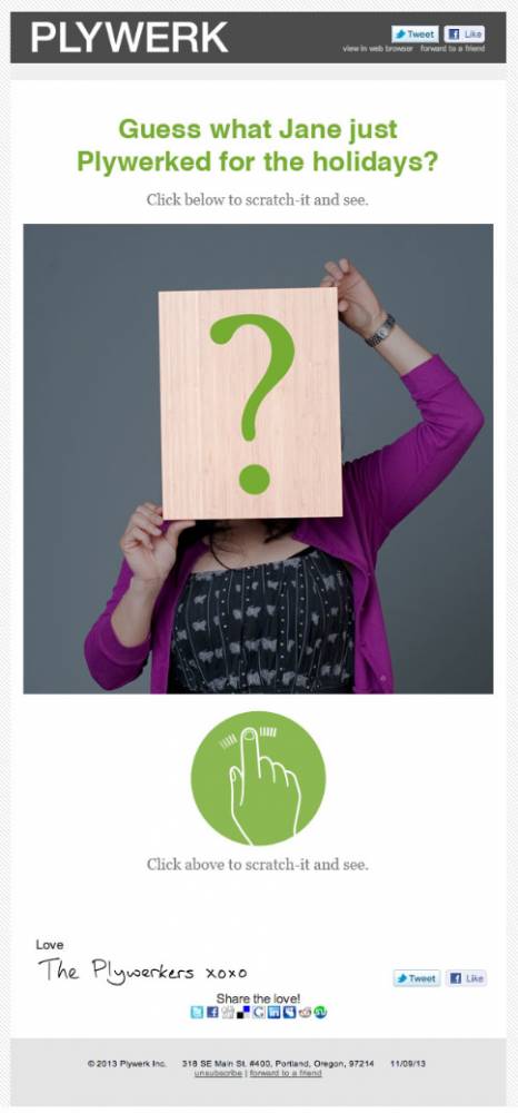
Missing the days where you could buy a scratch card and use a coin (or your nails) to find out if you won something with it? There’s no reason you can’t reinvent the experience in your emails! Especially useful for online retailers or companies with special sales from time to time, sending out an email where you have to “scratch” an area with your mouse (desktop) or fingers (mobile) will lead to a nostalgic, yet upbeat subscriber experience for your recipients.

MICROSITES
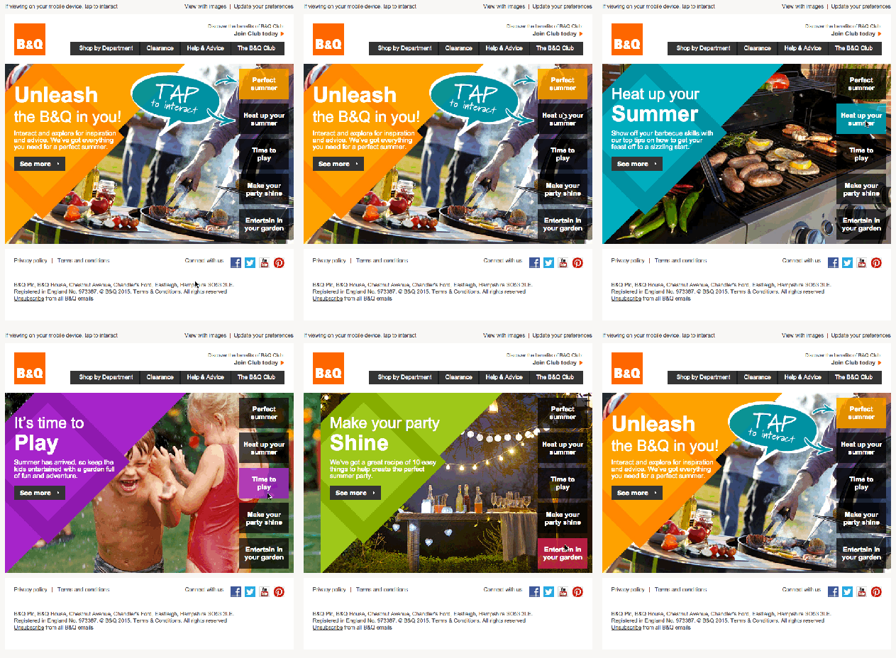
Since the programming language behind emails (HTML and CSS) allows email designers to create tabs and buttons within an email, there’s no reason why you can’t create a simple microsite within your email. Such an environment will let your subscribers find all information they need within the email itself, instead of having to click and travel to a landing page - a more app-like experience than ever before. Great news for companies who regularly send lots of content...

ONLINE PURCHASES
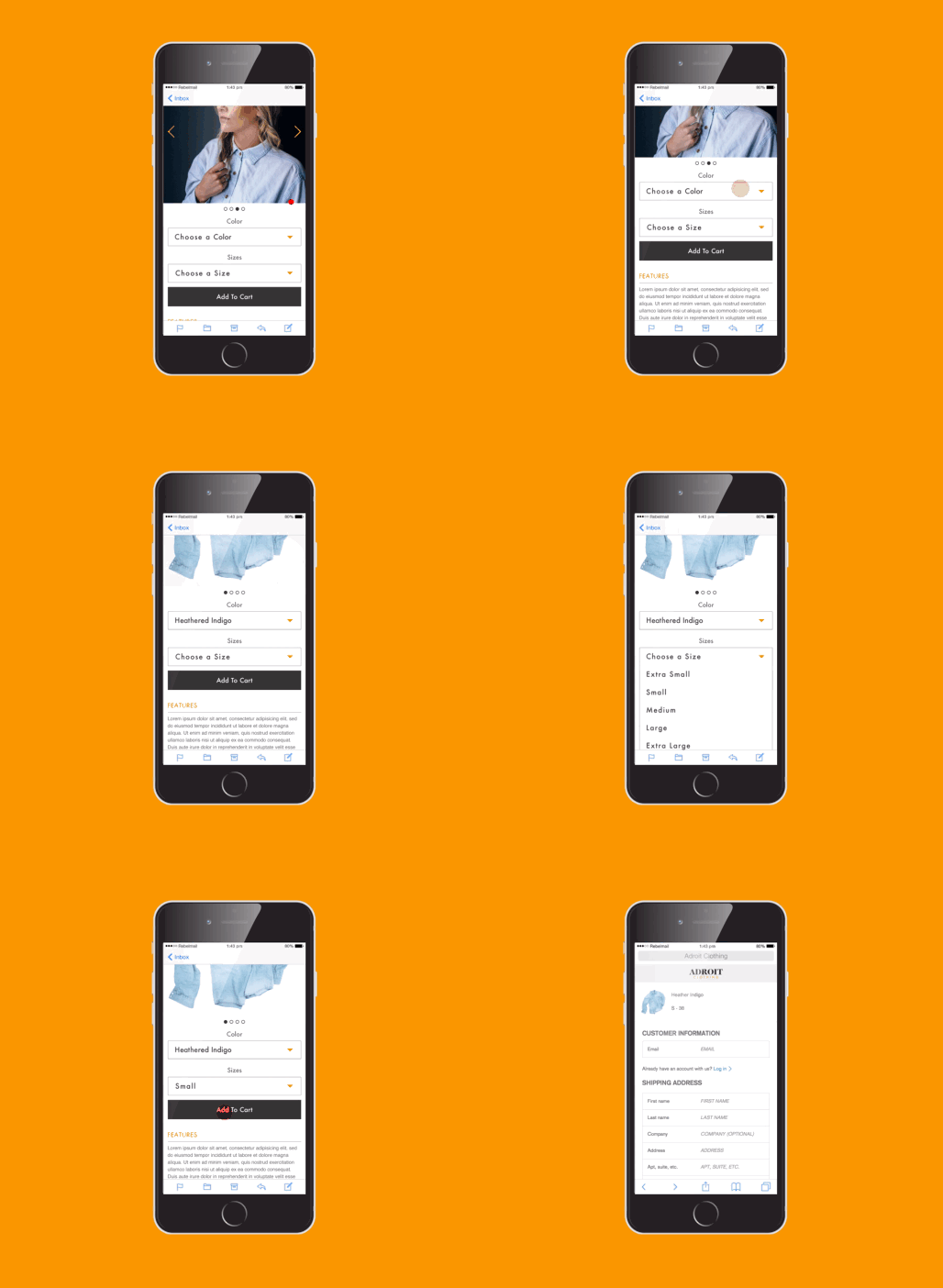
…and even for e-commerce companies! Imagine an email where you can browse products, choose something you like and buy it - all without needing to leave the email itself. Again, the programming behind emails can already make such solutions possible (even if not for all email clients). And the result: an immersive, seamless experience for all your subscriber-turned-purchasers, increasing revenues and customer satisfaction.

PUZZLES & GAMES
Looking to surprise your subscribers for Easter? Then why not create a game or DIY puzzle within your email which relates to your offering? From examples like Burberry sending out “customisable” scarves to Pret’s build-your-own frappe email, it’s the perfect way to amuse your subscribers while also nudging them to buy what they’ve created once they’re done. Particularly good for fun-loving B2C companies like AskBoosters game boosting services and NGOs.
+1: START SMALL
Like I said before: if you want to revamp your emails but don’t have the time and/energy to come up with a fully custom-made interactive email solution, don’t be scared to start small. Features like hamburger icons, slideshows, search bars and even videos will also hook your readers’ attention and keep them glued to your email longer than normal. Ultimately, the only thing limiting you in the interactive email design adventure is creativity. So go on - start small or go big, as you prefer. Then lean back and watch those email statistics sizzle.
Want to learn more about email design? Download our Email Design Guide for Savvy Marketers to get the most important pointers!


