Six Hacks for Creating an On-brand Email Marketing Template
Digital marketers of 2020 are expected to be as multifaceted as swiss army knives. From graphic design to social media to automation: they're expected to master all. But one of the most daunting, demanding and exciting tasks of today's jack-of-all-trades marketer might be to secure brand consistency across all touchpoints...
The Challenge and Importance of Brand Consistency
Brand consistency is one of the toughest challenges when delivering a message across different digital channels. As your customers transition from your emails to your website and social media, it's essential that they recognise your brand and its core values.
In this blog post, Gareth Emery, Head of Product Design at Apsis, shares his top hacks for how to use your brand's website as a reference for maintaining a consistent experience in your customer's inbox.
So if you’re about to create a new email template in Apsis One, browse through your website and look for an answer to the following questions.
What is the main colour of your website?
Every brand has a signature colour that’s easy to recognise. Apart from the brand’s main colour scheme, there are often a set of supporting colours that you as a marketer have at your disposal. A common mistake is to choose the main colour for one channel and then use a secondary colour for another channel.
For the sake of consistency and user journey, we recommend that you stick to your brand’s signature colour in all channels. So, how do you pick the right colour for your email template? Have a look at your website and identify the most prominent colour.
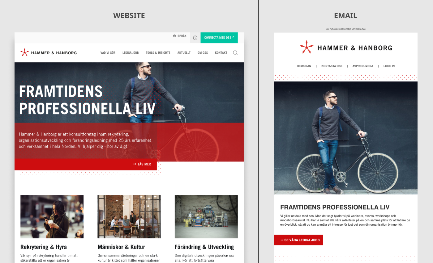
When looking at this website, it becomes evident that the email's main colour scheme should be a white background with red colour accents.
How's your logo placed?
The placement and styling of your brand's logo is another essential element to consider when you study your website. Just like website design, there's an unwritten rule in email design for placing the logo on the top of the page. When you add the logo to your email, make sure to give it plenty of space and keep conflicting elements, such as headlines and icons, at the appropriate distance.
What are your CTAs like?
To have an eye-catching CTA button is essential for making your customers convert from your email and move further down the customer journey. A CTA should grab your customer’s attention without compromising with the messages in your images and headlines. That’s why it’s important to nail the styling of your buttons.
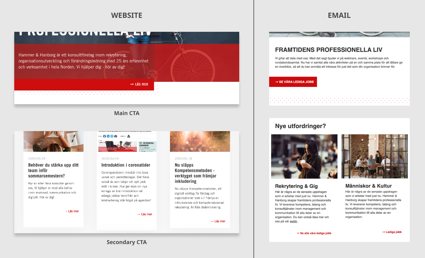
An important thing to keep in mind is that most brands use at least two types of CTAs. There's the main CTAs that often has bold text and big buttons, and there are often also secondary CTAs that have a more minimalistic style.
Browse your website and analyse different CTAs. Where are they placed? Are the edges on the buttons sharp or rounded? Is the text in bold? Look carefully and then mimic the styles in the Apsis One email editor.
What is the style of your social media icons?
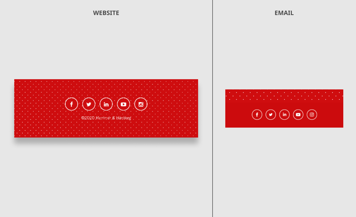
To have icons that link to your social media channels is industry-standard in email marketing. Adding visual elements from other brands can be tricky since it often conflicts with the styling and colour scheme of your own brand. In Apsis One, we’ve added icons that are officially approved by social media networks. This feature allows you to quickly add icons, apply styling and change link URL without leaving the editor. In the example below, the brand has created its own customised icons for social media.
How is your website treating text and fonts?
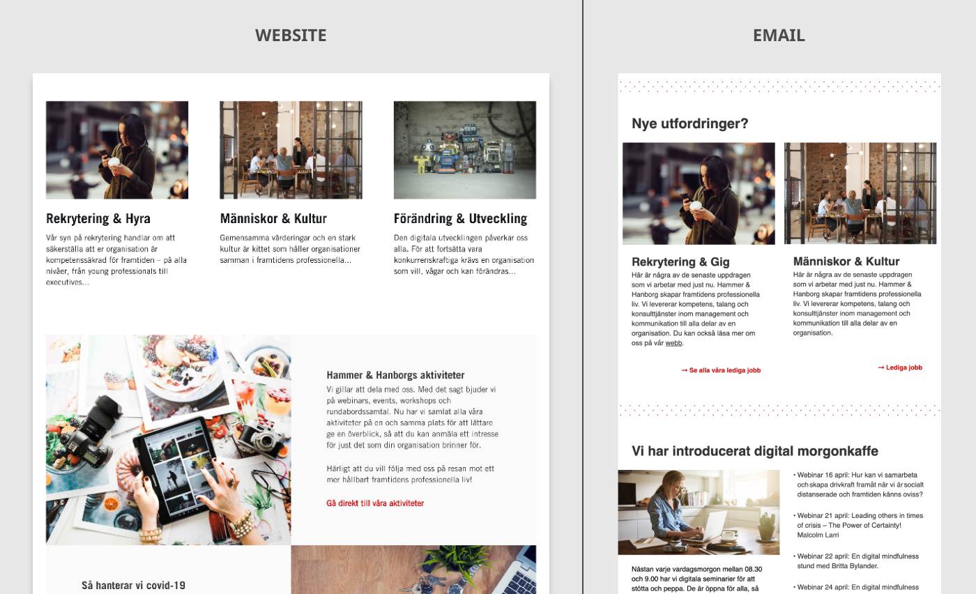
When it comes to text styling, the devil's in the details. To ensure brand consistency, you need to pay close attention to aspects such as styling and the colour of the different types of headlines and body texts. Are the headlines black and bold? Is the body text slightly grey? What fonts are you using?
How is the styling of your website footer?
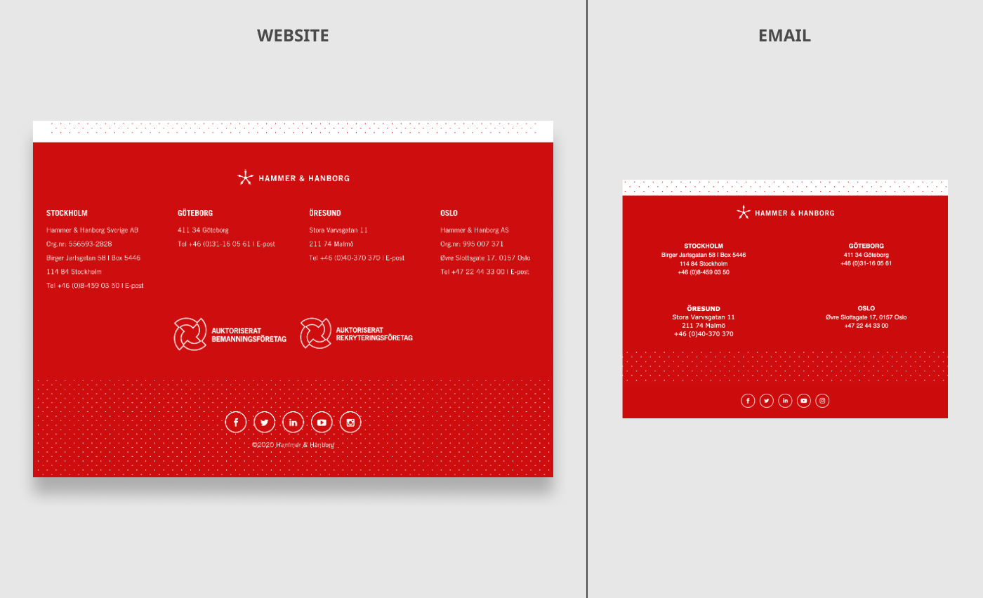
The footer is an element that the website and email have in common. When looking at the footer on your website, see which elements you can reuse in your email. Also, keep in mind that a website footer often contains a lot of information about links. However, you need to ask yourself if you need to include all of this content in your emails. Even though the information may be important, an email footer usually benefits from having a clean and minimalistic look.
