Ask An Email Designer: Fixing the lines in Outlook 2016
Email designers here at Apsis perform magic on a daily basis, so that the emails they work on really stand out in your inbox.
That said, there are always limits to what you can do when designing for email. And creating emails that are compatible with Microsoft Outlook has long been one of the tougher nuts to crack.
Which is why Email Designer Tim Hansson from Apsis Creative Services decided to take you through fixing a specific problem in Outlook 2016, step-by-step, in this "Ask An Email Designer" post!
How to fix the "evil" lines in Outlook 2016
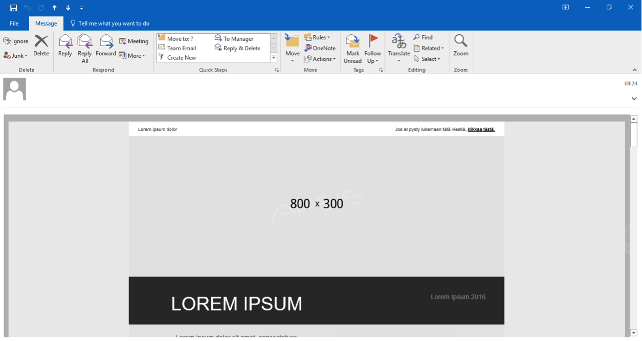
Since the early years of email, Outlook has challenged us when it comes to making great email design. Like what happened with Outlook 2016: not long after its release, we started noticing strange lines showing up in different places, like in the example below:

Many moons passed, and we almost turned bald trying to figure out why these lines kept appearing in our newsletters. Eventually, we took to the internet on a series of quests to find a solution - however, we found nothing and returned empty-handed, almost without hope for the future.
And then, on a sunny morning, when birds were singing and the stakes were high, our brave knights of email finally found a fix to make these "evil" lines disappear!
This is how we did it:
1. By changing the body background colour to match the content’s background colour, we could also control the colour of the lines appearing in the newsletters.
<style type="text/css">
body {
...
background-color: #ffffff; <!-- Controls the color of the lines -->
}
</style>
But we still had an issue: the lines continued out to the right (see below).

2. By wrapping our content with a table and adding "overflow:hidden;" to the <td> tag, we hid the line to the right.
<table width="600" border="0" cellpadding="0" cellspacing="0" align="center">
<tr valign="top">
<td style="overflow:hidden;">
...
</td>
</tr>
</table>
The final result:

Please note: this works best for templates that have the same background colour throughout the whole content.
Download our timeless Email Marketing Handbook for even more insights on email design!
Things to consider:
Before embarking on the magical trip of killing lines, you might want to consider: is Outlook even worth the trouble?
This question has two answers. Is the client targeting B2C subscribers? Then no, it's not worth it. B2B on the other hand? We're afraid that the answer's yes.
You should also keep in mind that as long as you have a white background throughout the whole email, you’re safe. Since the colour of the lines is based on the body background colour, the difficult part is having different background colours for different sections in your newsletter.
(It can still cause issues, as the colour of the lines is based on the body background colour.) The point is: it’s only possible to see tone colour for the lines.
Also, keep an eye out for the overpowered margin in Outlook that can’t be removed. If you have another colour than white behind your content, it might look a bit strange.

Any more questions about email design?
Get in touch with our fantastic Digital Marketing experts today - they'll have the answer!


