Improve your campaigns with visual marketing
We’re living in the digital age, there’s no denying it. Visual marketing is an incredibly important way to cut through the noise and place your brand front-and-centre in an audience’s mind.
That might sound daunting, but it’s not. As everyone struggles for relevance and strives to create shareable, viral content, the noise can drown out the most well-thought out idea.
One of the more frequent ways businesses communicate with customers and prospective customers is via the humble email. When done right, these have the power to sell experiences to the most spend-thrift person alive. If your email is bland, someone who was geared up to splash some cash could be turned off.
Visual marketing, as the name suggests, is all about pictures, graphics or video. These have tremendous power, yet it’s rarely acknowledged. Images can put a person in a certain mood - but it has to be the right picture. That means you’ll need to have a good think about what sells your brand and what your company provides before making the leap and including it in your marketing.
You can use visuals to improve results and gain more followers just by using the right visuals with the right content. That’s some incredibly powerful stuff!
This blog post will seek to provide some answers to your questions, and will help you understand why visual marketing is so important and how you can use it to improve campaigns. Before we get all of that underway, let’s run through some quick frequently asked questions.
What is visual content marketing?
This is marketing carried out using visual material, images, video or graphics that promotes a product or service. For the experience industry, this could be a branded TikTok showing off the latest adrenaline activity to customers, or you could produce a summer email campaign with some stunning images to attract wine tourists to your region.

There’s plenty of ways you can pull off visual marketing, and the main thing is to invest in some solid content and have a good way of delivering that to people, be that through a creative email or social media. Understanding this information, we can appreciate innovative approach to utilizing gamification in their promotional efforts. Through the integration of cool game mechanics, they transform the perception of services, products, or news, engaging users in interactive and rewarding experiences.
Why is visual marketing important?
Ah! Another great question. Producing content with heaps of compelling imagery is all well and good, and a lovely idea, but there’s no point if it doesn’t work.
Fortunately, there’s heaps of evidence to suggest that it does. According to research presented at The Power of Visual Marketing webinar, hosted by Apsis in collaboration with Jumpstory, people only read about 62 words per web page, which takes them 15 seconds. After three days they only remember about 10% of what they read.
Compare this to visuals. Content with photos or visuals encourages people to read on - in fact 80% of people are more willing to read a piece of content that includes photos or visuals.
Furthermore, they will spend 15 seconds processing each visual (so that’s more time spent on the page), and will be able to remember 65% of the information after three days. Plus, articles with images get 94% more views.
Is visual marketing effective?
So yeah, as we can see, this can be a really effective way to drive traffic and retain users. When you do that, business is likely to increase, brand engagement definitely will and revenues can increase along with bookings.

Basically, no company can do without it.
How to find the right visual
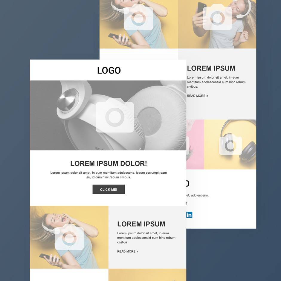
A great example of visual communication is the creative email. Using a good email tool, you can spice up your email marketing thanks to integrated image libraries, icons, illustrations and video.
Naturally, a desire for imagery could lead you to Google Search - but this can create issues. Do not download images directly from Google Search, while using downloaded pictures from websites such as UnSplash can also land you in hot water because it doesn’t necessarily mean you have the rights to use the image for a commercial purpose.
Rather, search for media that gives you creative commons rights. That’s the way to go about things!
Most modern marketing platforms now offer integrated image libraries that provide free, high-quality stock images, illustrations and icons - like Apsis One! Users get free and unlimited access to over 10 million visual tools. There’s no danger of running foul of copyright law when you’ve got your hands on as many visual elements as that!
Creative emails boost your campaigns
One of the easy victories you can claim in your battle to improve campaigns with visual marketing is via email. We touched on it briefly in the point above, but one thing we didn’t explore was how it can help with brand consistency and recognition.
That’s because proper marketing with compelling visuals really help to set your company apart from your competition - and that rings true whether you’re involved in the experience industry, eCommerce, B2B, whatever!
And the best thing is, your visuals don’t have to be complicated. They just have to be consistent. As long as it represents your brand, you’ll be on to a good thing.
How to use visuals consistently
Branding is important because it defines who you are in relation to the rest of the market. Clear branding within your email marketing campaigns can help make them into a success because it communicates with your audience in a way they’ve come to expect.
Furthermore, expressing a brand identity will help you show off your values - email is a great place to do that because once you grab your reader’s attention, you have the potential to spend far more time with them than you would on social media or via a banner ad.
Consistency is key here. Keep your brand recognisable, maintain the same tone of voice across channels and follow a visual design pattern.
- Display your logo or brand at the top of your email. This is the first thing recipients will see, so it needs to be prominent.
- Use signature colours to allow for consistent branding and a simplified design process. Readers aren’t going to stick around if your design is confusing - so stick with clean, simplified and straightforward looks.
- Text size makes a difference. If you send a longer email, use size 14. For shorter messages, 16 could be better.
- Images in email are important! But, pick some that pair well with the colour scheme you use in your email. Furthermore, it’s important to use pictures that work well across all devices, and test them to make sure they do. Oh, and they also need to be relevant to the content you’re promoting. If you do marketing for a museum, you wouldn’t use a picture of something that your customers couldn’t see during their visit would you? The same applies to all other aspects of visual marketing.
- Use web-based fonts such as Arial, Comic Sans, Courier New, Georgia, Lucida, Tahoma, Times New Roman, Trebuchet Ms and Verdana. This makes sure that every client will be able to read your email, as some might not support specialist fonts.
Templates are king
If all this sounds like it’ll use up heaps of your valuable time, don’t fret! Grab yourself a powerful email template tool, combine it with marketing automation to make sure the right people are sent the right content, and you’ll be on to a winner.

That means all you have to do is set up your email once, then return to the template for the second round, change a few elements and then send another bucket of emails that stay consistent with your branding.
As almost half of all emails are read on mobiles, you’ll need to find a platform that designs responsive mobile emails as well - something like the Litmus Email Client Test works well.
An invaluable tool
When done right, this can lead to an increase in brand accountability and trust. It can boost your brand and help contribute towards your business success.
Companies that create the best visual marketing pieces work with graphic designers, marketing teams and customers to learn what works and implement it effectively.
Furthermore, there’s nothing wrong with learning from real-world results. There’s hundreds of examples of compelling visual marketing all around us - just look at Airbnb.
And above all, have a good plan. That’s why resources like this content marketers calendar for those working in the experience industry is so important - so head to the link and download yours today!


